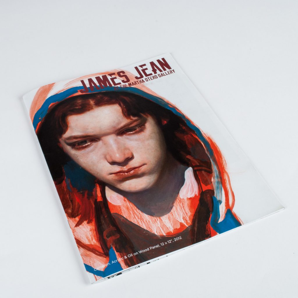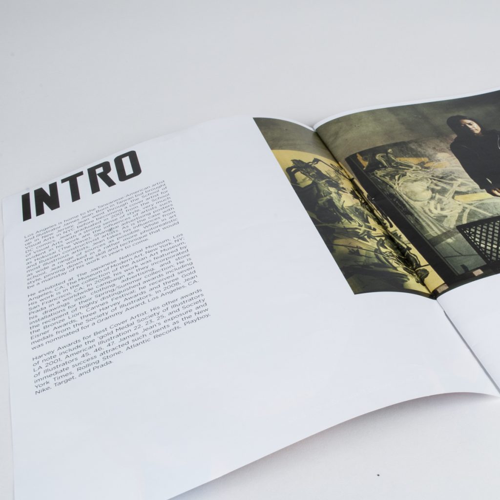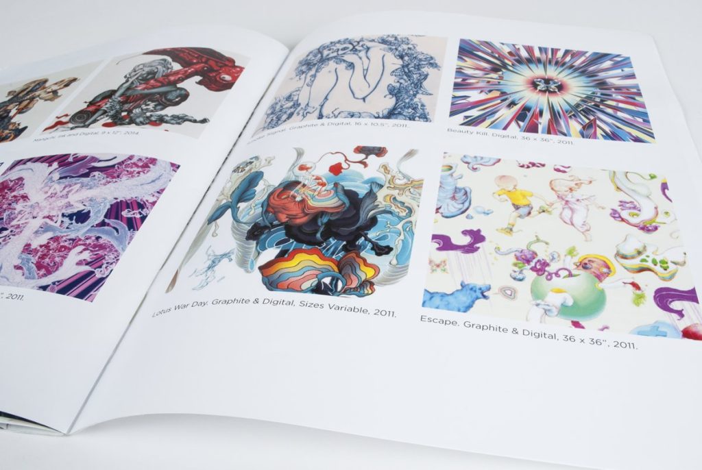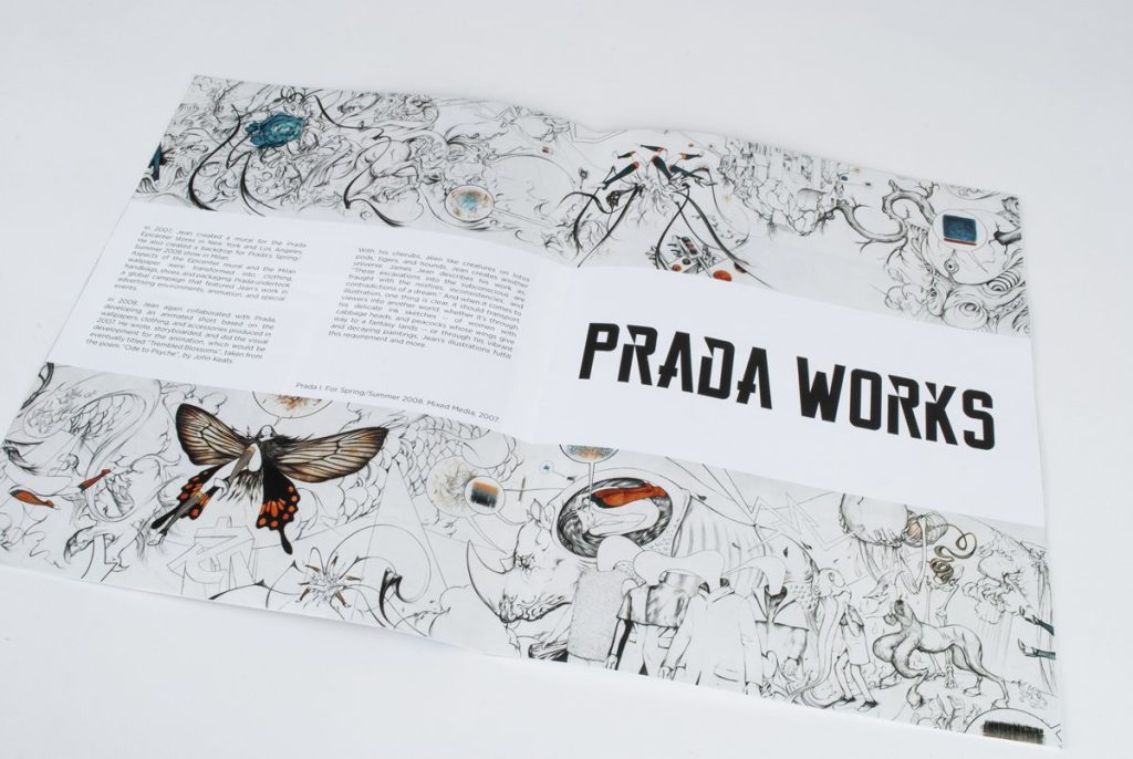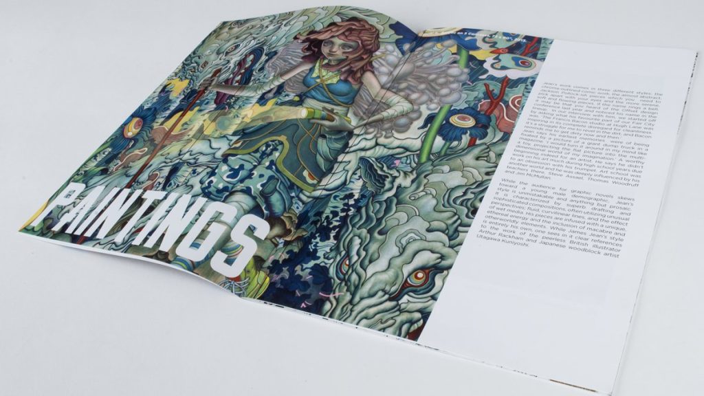
This was a booklet I made back in college, however it really is one of my favorite examples of layout design I have done. Getting the opportunity to get the work to be a part of the design, find new ways to get imagery to interact with text as opposed to plopping it all on the same page and calling it good.
Focusing on the heavy use of imagery, and mostly minimal yet unique typography. I hope I was able to highlight James Jean’s work, his use if color and psychedelic-like imagery really blows me away.