
While with Spok, I had the opportunity to refresh their solution pages. This meant I was able to update the foundational schema, the design, as well as the content.
Secure messaging is a term we are highly ranked in and this page is very high performing. However I feel like this page really just helped accent that, our multitude of informative blogs, case studies, and resources are what really fuel our credibility. However, this page focused in our navigation, connecting it to all of our platform and other solution pages, really tells search engines that that is a primary focus for our business.
Not only that, I ensured our meta description, url slug, page title, statements throughout the page were very honed in on secure messaging and related terms. Our customers wouldn’t just search “secure messaging” they also want something that is HIPAA compliant. They might search “HIPAA compliant messaging” amongst other options.
Another really simple focus is that we don’t have too much here other than showing our product, some of the problems it solves, and CTAs that direct to a landing page to set up some time with sales.
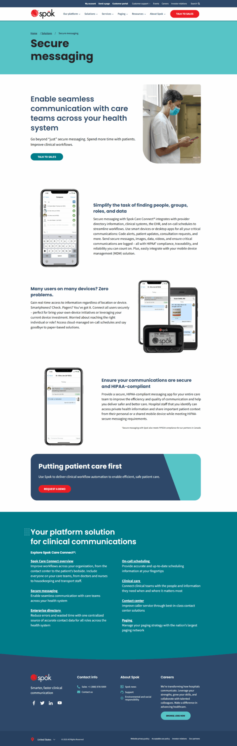
The footer is another strategic move. Footer sections like this are a great opportunity to connect all the products, solutions, or other information with each other without stuffing a page with unnecessary information. Users have the option to explore more without any over-explanation.
This page is one of the top viewed pages overall on Spok.com currently and has been since our original updates in 2023. We continue to make adjustments as we see search engines and AI citations ebb and flow.